Quick post for today – Stock-Spike (https://stock-spike.com) is back online (and looking rough as ever). This was a project born out of my first forays into Wallstreetbets before the COVID-times and attempting to implement trackers for a few of the strategies (or interesting conditions) that popped up from time to time. After the whole GameStop fiasco it’s been harder to find good analysis on there, so with the market at all time highs it might be a good time to start talking about what interests me at the moment.
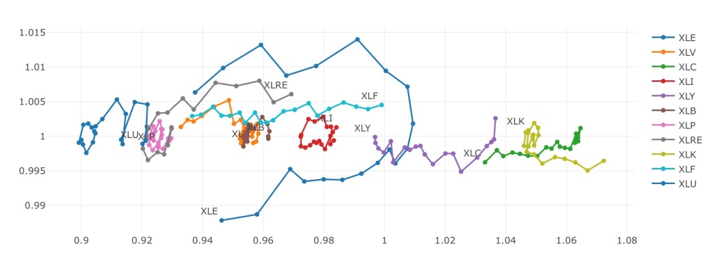
The key chart up there for now is Sector ETF Rotation, built off of my interpretation of the Relative Rotation Graphs from Julius de Kempenaer). These don’t show absolute returns, but will track performance of an item against a benchmark. For the current display it is showing relative performance of each sector ETF against the broad SPY ETF on a weekly scale. The X-axis shows you over/under performing and the Y- tracks the rate of change of that performance, so items should “rotate” in a clockwise fashion as they become relatively stronger and weaker to the S&P500. Top right quadrant is where you want to be, lower left means your money is better off in the benchmark. The other two quadrants end up being “transition” places that will move towards the others.
In the current plot XLK has found a nice area outperforming (which makes sense given how tech has been doing) while XLC (communications services) continues its fall – still outperforming SPY but my position might not be long for this world. Keep an eye on financials – XLF has been on a tear over the last 20 weeks and is on track to outperform (XLRE right behind).
The Tech
I know I talked about loving the Python library Dash earlier (and I still do) but the more Go I write and deploy the less Python I want to mess with outside of work. Stock Spike was my first project in Vue and then became my first project in React, so it’s only fair to keep it with a frontend framework. It’s up with React using MUI components and charts are provided by Plotly.js (to keep with the Dash theme).
Everything is static at the moment while I work on recreating some old Python scripts in Go for a more stable backend to use as an API. As a frequent Pandas user I’m really seeing what I’ve been taking for granted all these years….
